Example of application of the SOM:
World Poverty Map
The Self-Organizing Map (SOM) can be used to
portray complex correlations in statistical data. Here the data
consisted of World Bank statistics of countries in 1992. Altogether
39 indicators describing various quality-of-life factors, such as
state of health, nutrition, educational services, etc, were used. The
complex joint effect of these factors can can be visualized by
organizing the countries using the self-organizing map.
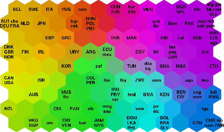
Countries that had similar values of the indicators found a place near
each other on the map. The different clusters on the map were
automatically encoded with different bright colors, nevertheless so
that colors change smoothly on the map display. As a result of this
process, each country was in fact automatically assigned a color
describing its poverty type in relation to other countries.
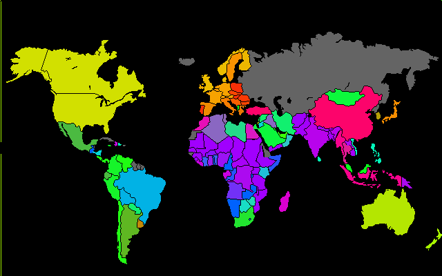
The poverty structures of the world can then be visualized in
a straightforward manner: each country on the geographic map has been
colored according to its poverty type.
Countries organized on a self-organizing map based on
indicators related to poverty:

A map of the world where countries have been colored with the
color describing their poverty type (the color was
obtained with the SOM in the previous figure):

This page is maintained by
Samuel.Kaski@hut.fi.
Last modified 22.9.1997
URL: http://www.cis.hut.fi/research/som-research/worldmap.html
